Loading
Homepage
  • Client:  Office of the Auditor General of British Columbia
  • Reports

Office of the Auditor General of British Columbia

From 2009 to 2021, branding and graphic design standards were developed and implemented to ensure consistency across multi-page reports for the Office of the Auditor General of British Columbia. Each report featured multiple data visualizations and impactful infographics, making complex information more accessible and engaging for government and public audiences.

Design rational

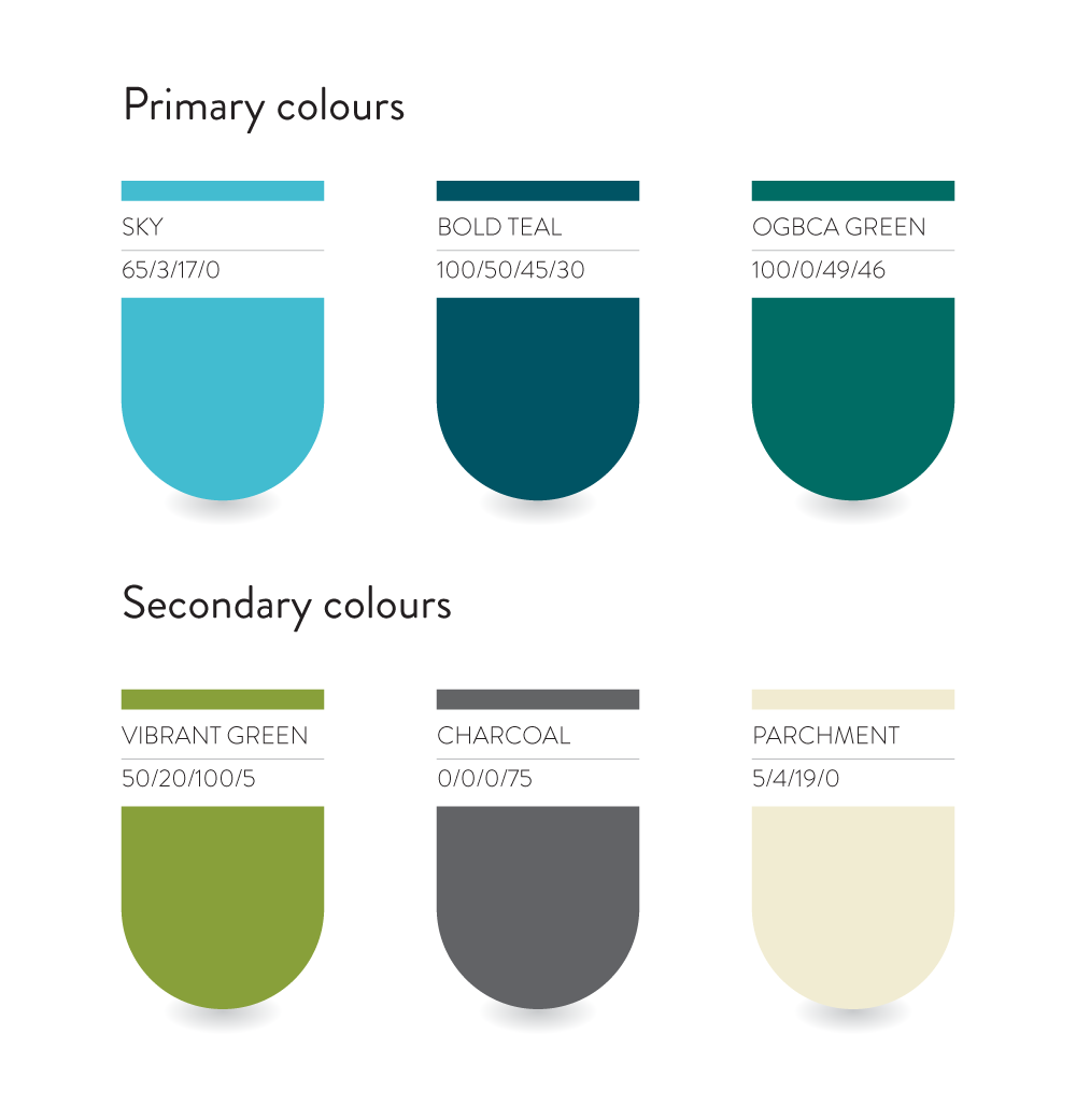
For this report, the Office of the Auditor General of British Columbia’s (OAGBC) green is used subtly and instead informs a refreshed analogous palette. A vibrant blue sets the tone, offering a sense of confidence while remaining calm and easy on the eye.

Headlines are set in Stratos, a modern and flexible typeface. Section headers appear in all caps to add structure and presence, while sentence-case subheads provide a more approachable tone. The contrast between compact uppercase and sincere lowercase brings a clean and contemporary rhythm to the layout.

Body copy is set in Adelle, a friendly slab serif with just enough personality to feel engaging without distracting from the content. Its warmth and clarity make it especially effective for long-form reading, supporting both accessibility and readability.

Report Highlights

In addition to producing comprehensive multi-page reports, work for the OAGBC involved developing strategic infographics that translated complex data into accessible visual formats. These custom data visualizations were purposefully designed to support public communication and media distribution, aligning with the OAGBC’s responsibility to report to the public.

Similar projects

Looking for impactful results driven by strategic design?​

© Erica Solberg 2025. All rights reserved.

+
+